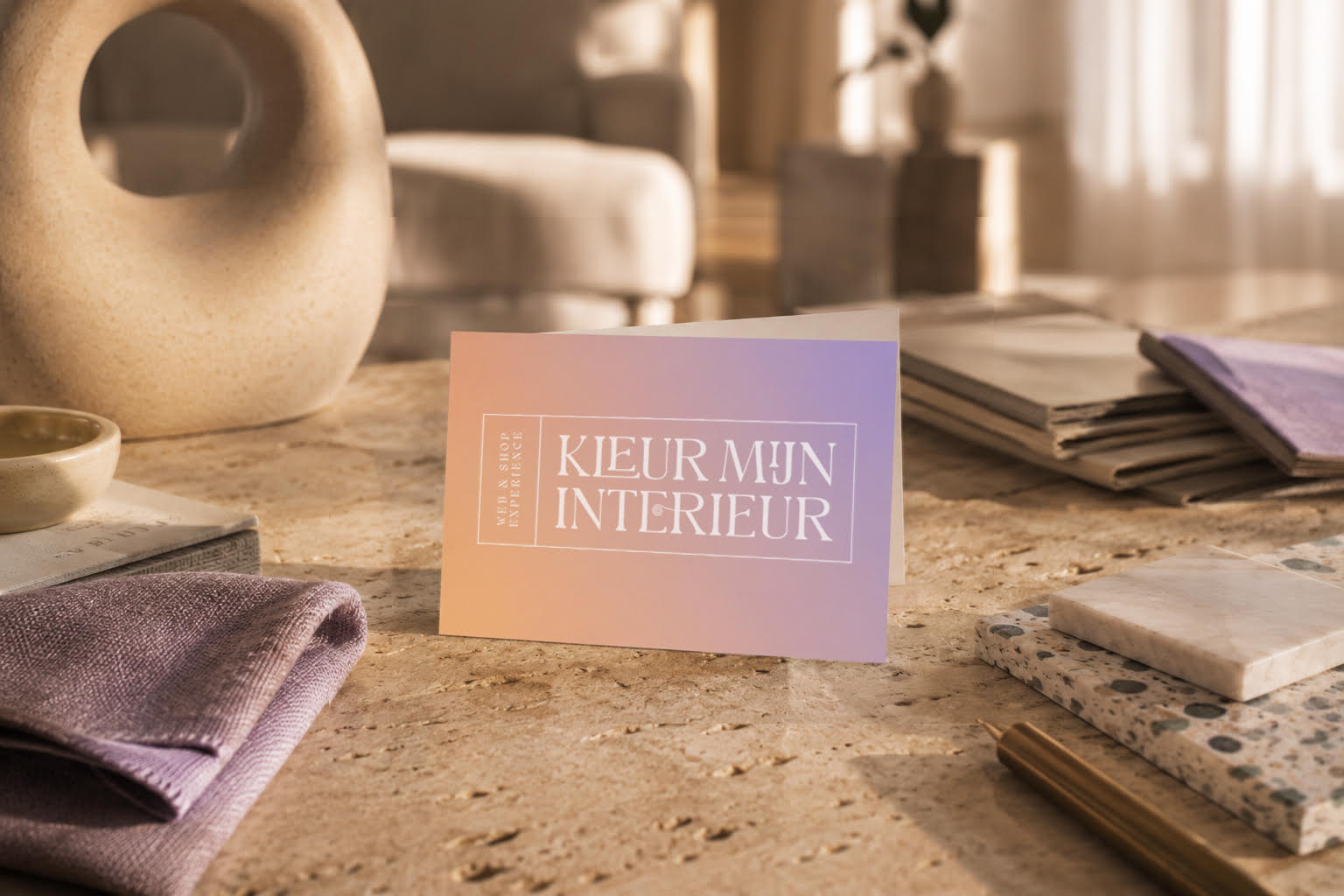
For Kleur Mijn Interieur, we created a brand identity that brings together creativity, confidence and accessibility. Built around the idea that color transforms more than spaces alone, the brand was designed to inspire people to shape interiors that truly reflect their personality and lifestyle.
From strategy to visual identity, every element was developed to feel warm, expressive and approachable, while maintaining a strong contemporary character. The result is a vibrant and recognizable brand experience that translates seamlessly across digital touchpoints, imagery and communication. A colorful identity with clarity, personality and room to grow.
The chameleon at the heart of the brand identity became the perfect symbol for adaptability, creativity and personal expression. More than just a visual element, the mark reflects the idea that every interior evolves with the people living in it. Its flowing and dynamic shape gives the symbol a playful yet refined character, allowing it to seamlessly adapt across different applications and moments.
Just like color transforms a space, the chameleon represents movement, change and individuality. This creates a distinctive and flexible visual language that gives Kleur Mijn Interieur a recognisable identity full of personality and creative freedom.
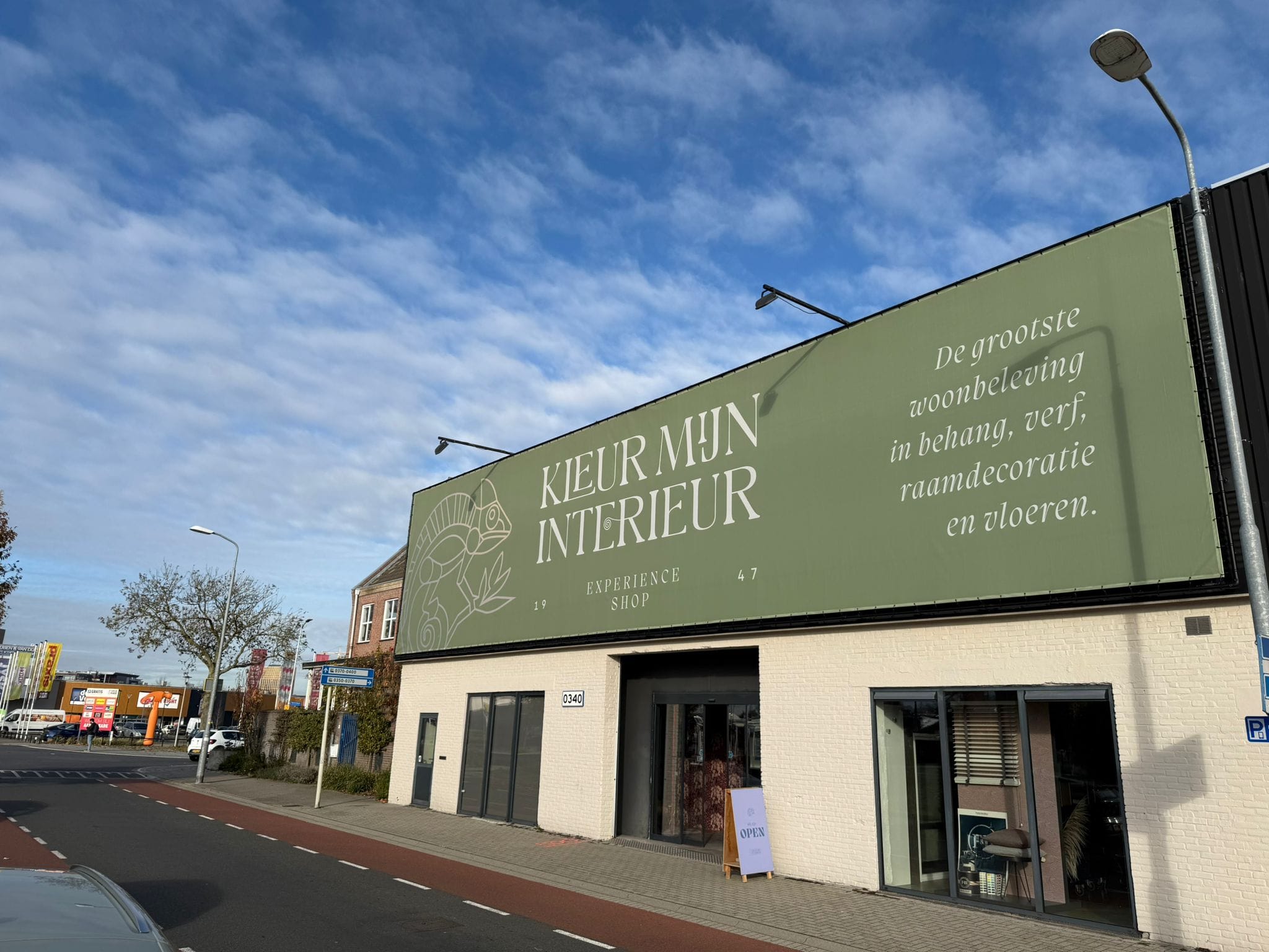
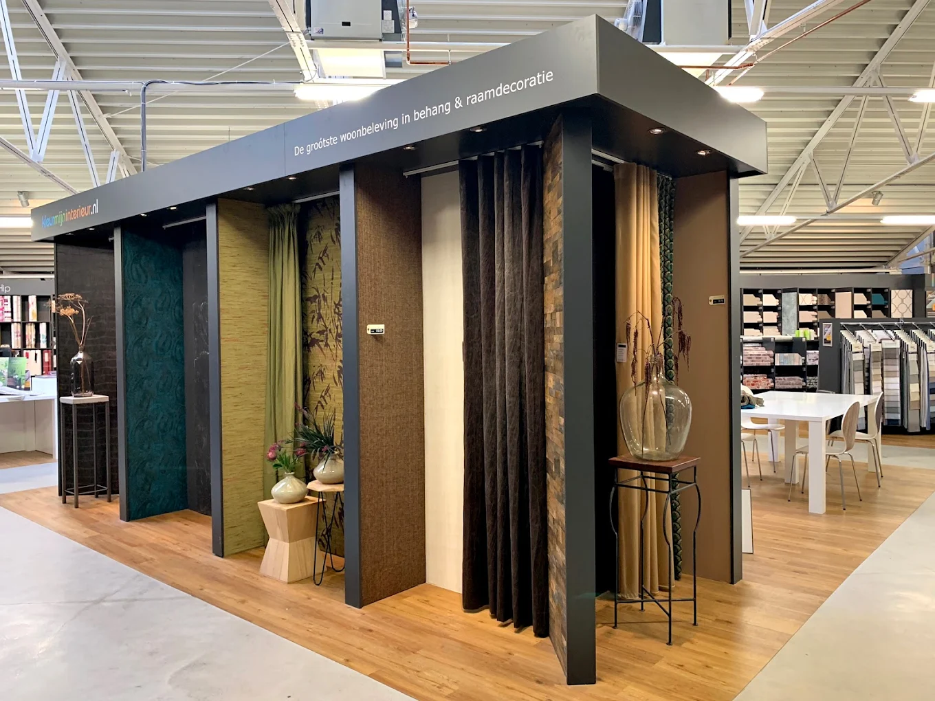
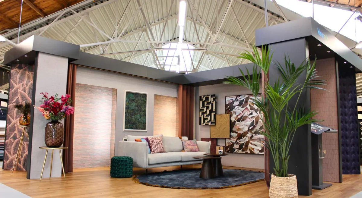
The physical store is designed as a spacious and inspiring interior destination where visitors can fully experience the world of color, materials and atmosphere.
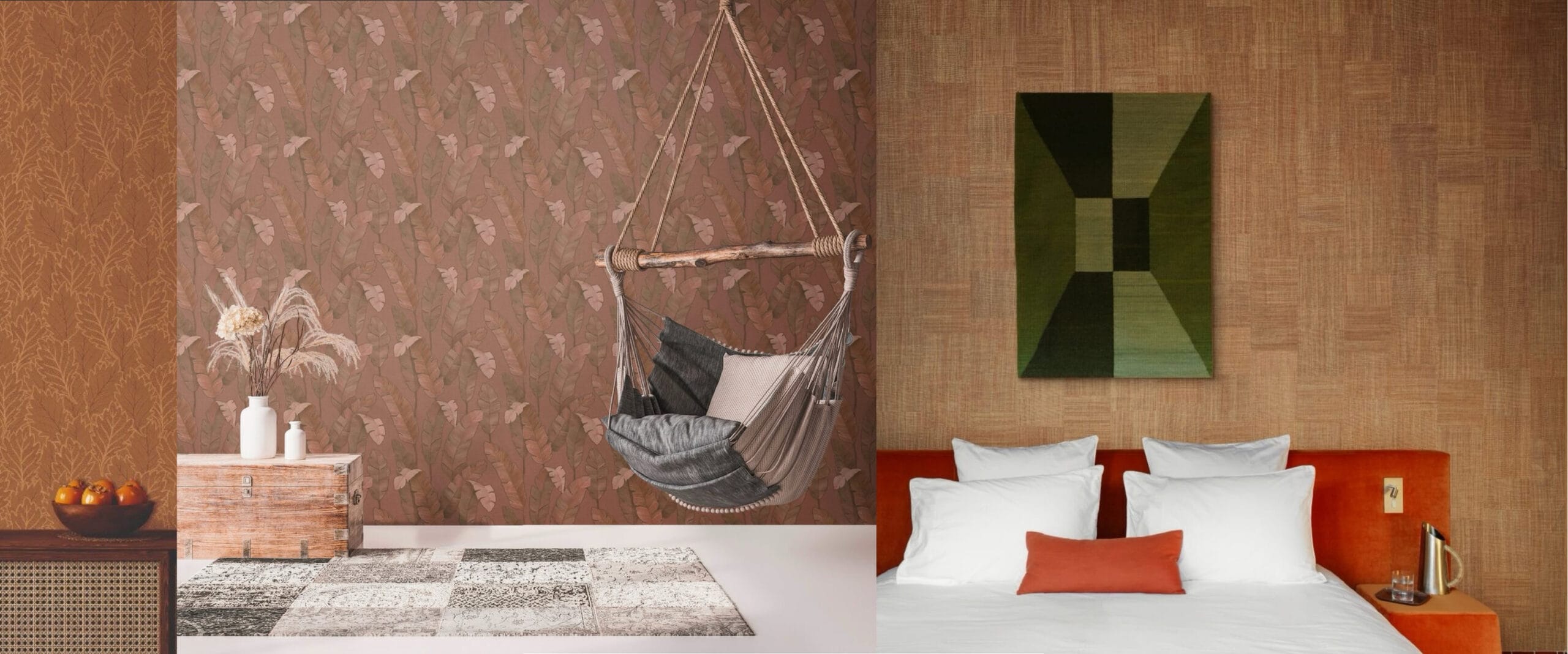
With a carefully curated collection of over 25,000 wallpaper designs, ranging from timeless textures to bold statement patterns, the space offers one of the largest and most immersive home experiences in the Netherlands.